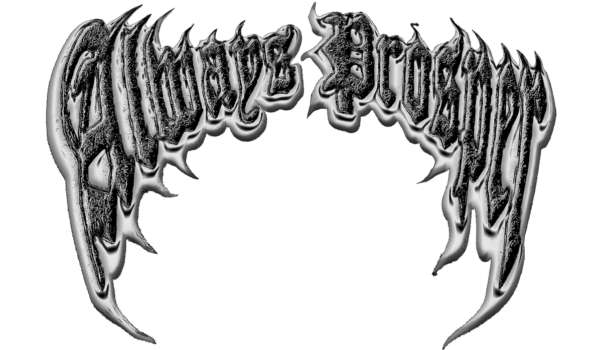
The chrome script is drawn by hand, letter by letter, and it took four rounds before it stopped looking like a band poster.
Metal was the point from the start. Something that catches light the way a car does at night on Figueroa — cool in the shadow, hot in the highlight. Flat silver reads cheap; a real metal ramp reads expensive. The difference is the reflection, not the color.
Clean Grid, Molten Type
Around the lettering, everything else stays quiet: hairline rules, wide-tracked labels, nothing but black, white, and one orange. The tension between the clean grid and the molten script is the identity. Lose either half and it stops working.
The grid keeps it honest. The metal keeps it loud.
Avery Cole
On garments the script is printed, not foiled — foil cracks. Printed chrome ages with the piece instead of flaking off it.